ROLE
Lead UX/UI Designer
DEVICES
All (Responsive Web)
DELIVERABLES
Site Architecture
User Flow
Wireframes
Prototypes
Mockups
Design Library
OVERVIEW
As the lead UX/UI designer, I was tasked with several projects for Lucid, a web-based virtual world builder. The major tasks include creating a design library from scratch, developing user flows for the entire experience, designing the UI, and creating the onboarding experience for all virtual worlds.
PROJECT 1
COMPONENT LIBRARY AND UI DESIGN
I had six weeks to design the UI for the entire product; one week was spent re-designing the user flow, another week designing wireframes, the rest of the time was spent designing the UI.
When I was brought on board for this project, the following was already established by the creative team and development team:
User research - conducted from 30 surveys
Art direction of 3D worlds
Brand guidelines
COLORS
White is used as the primary background color for all pages of the product, which is contrasted with black buttons. Purple and blue are our brand colors that are used on all important buttons.
TYPOGRAPHY
I used Jost for both titles and body text because clean and yet elegant in its readable simplicity.
ICONS
I used the icons from the UI kit because of their gently rounded shapes; friendly yet legible.
BUTTONS
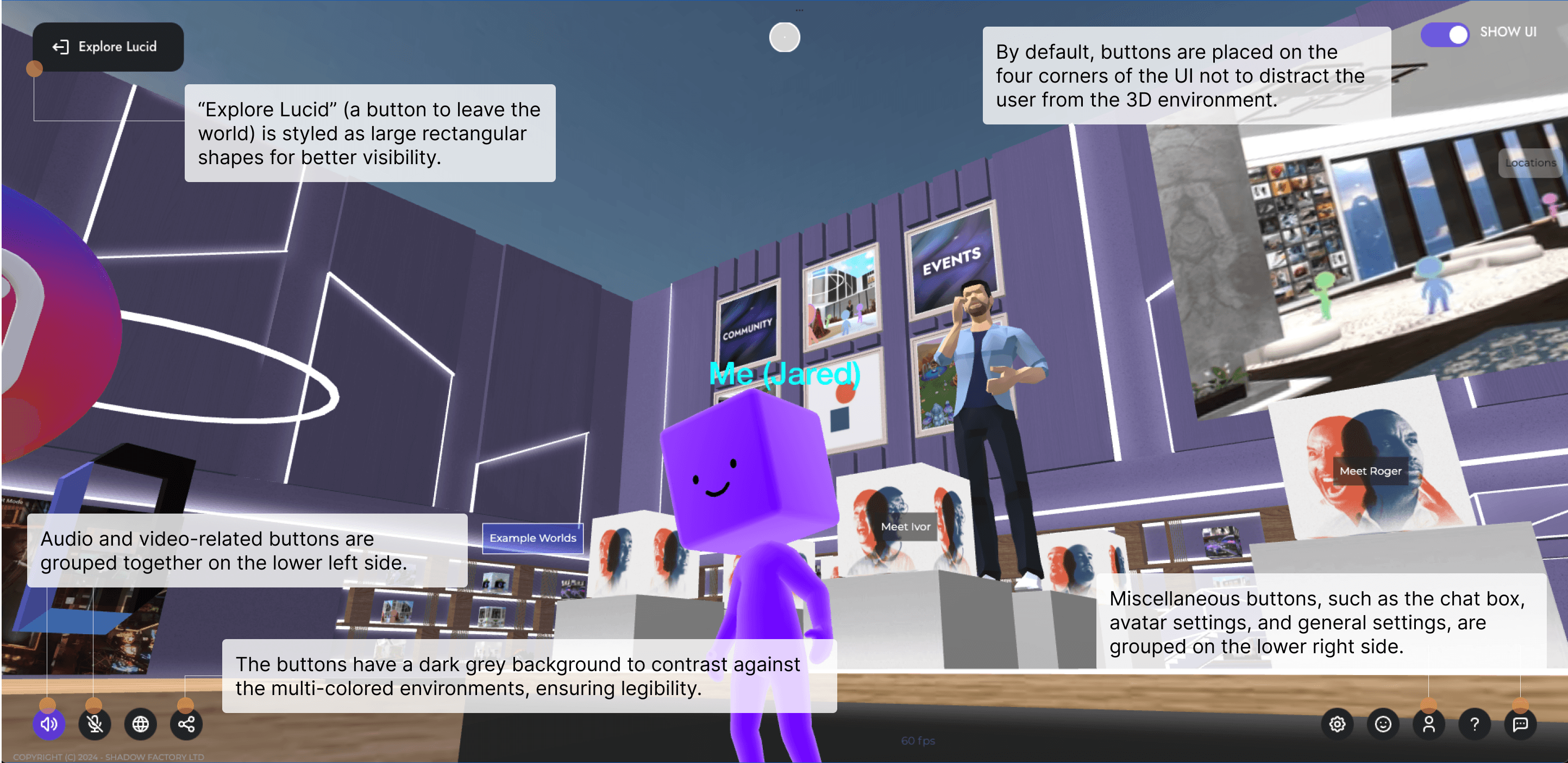
Black buttons are prevalent in the UI of 3D environments, while purple is across all buttons in modals.
Design elements from the component library were applied across all pages (e.g. sign up / log in page)…
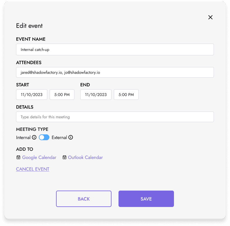
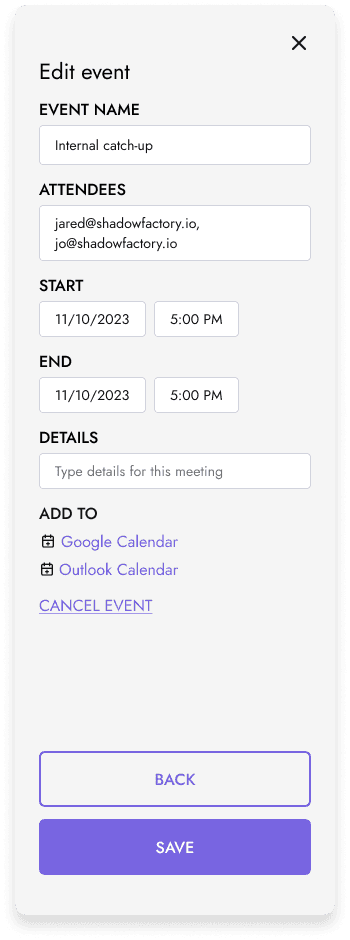
…and across all modals in the experience.
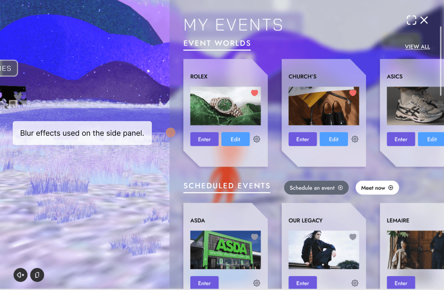
Blur effects from the UI kit were used in UI elements in our virtual worlds.
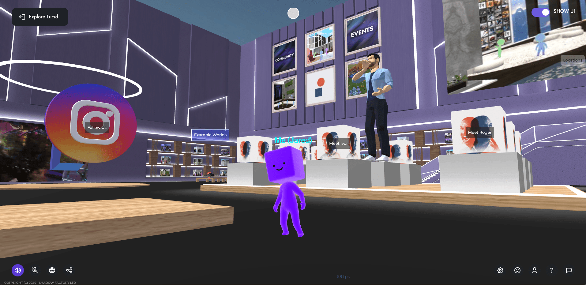
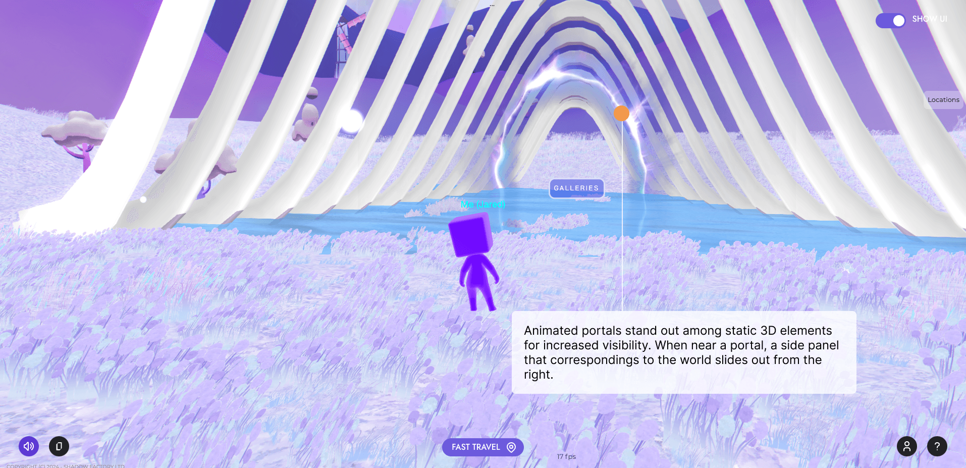
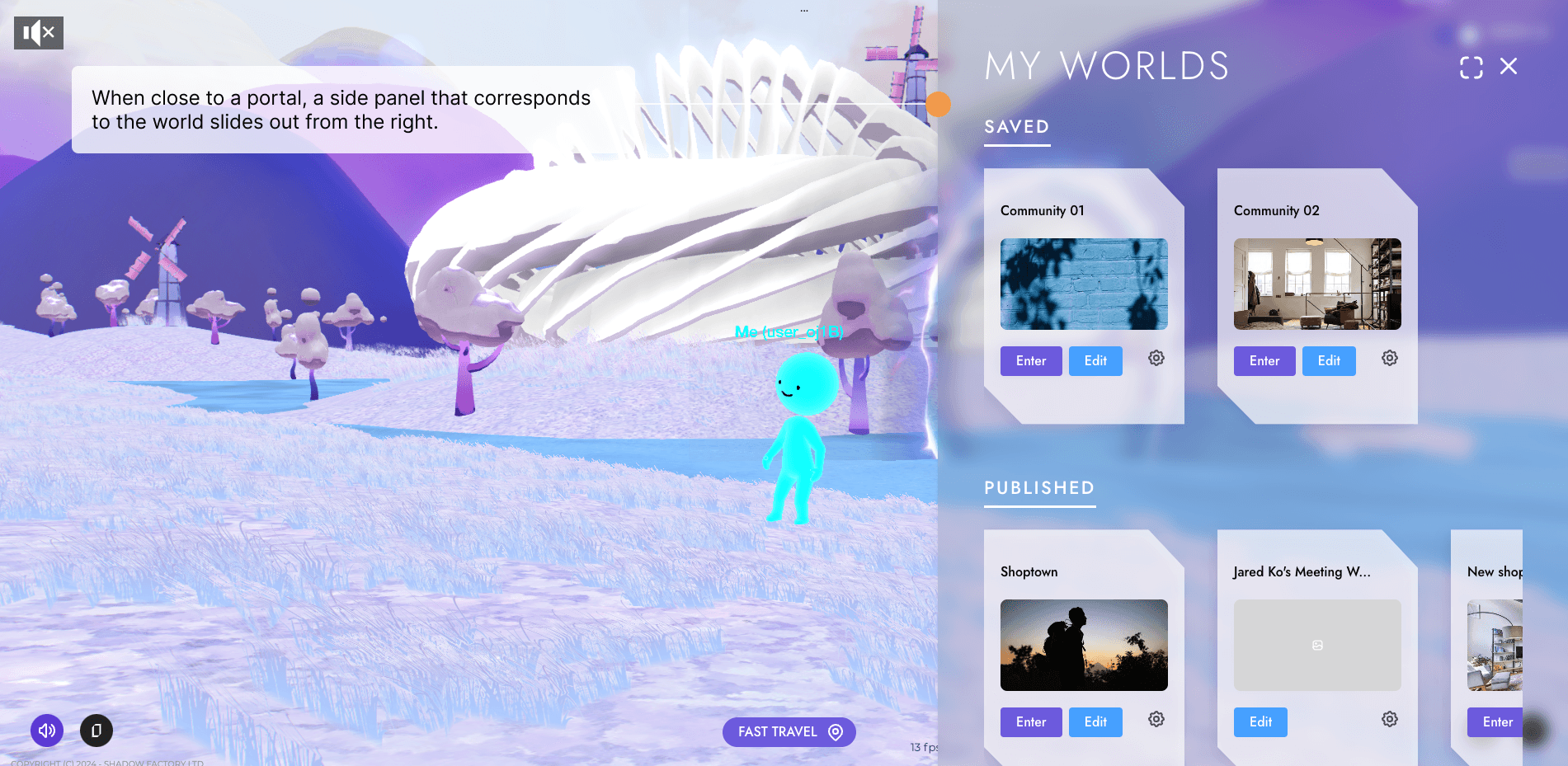
In-world UI is based on video game design conventions.
PROJECT 2
HOME WORLD UI
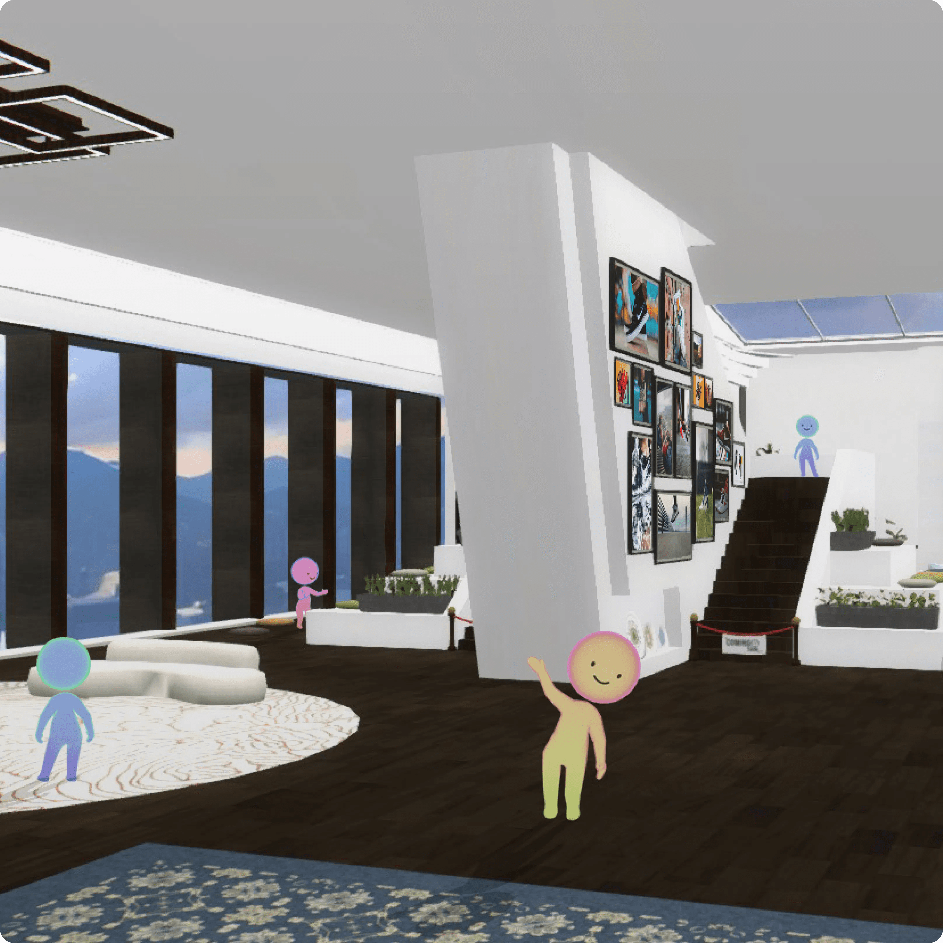
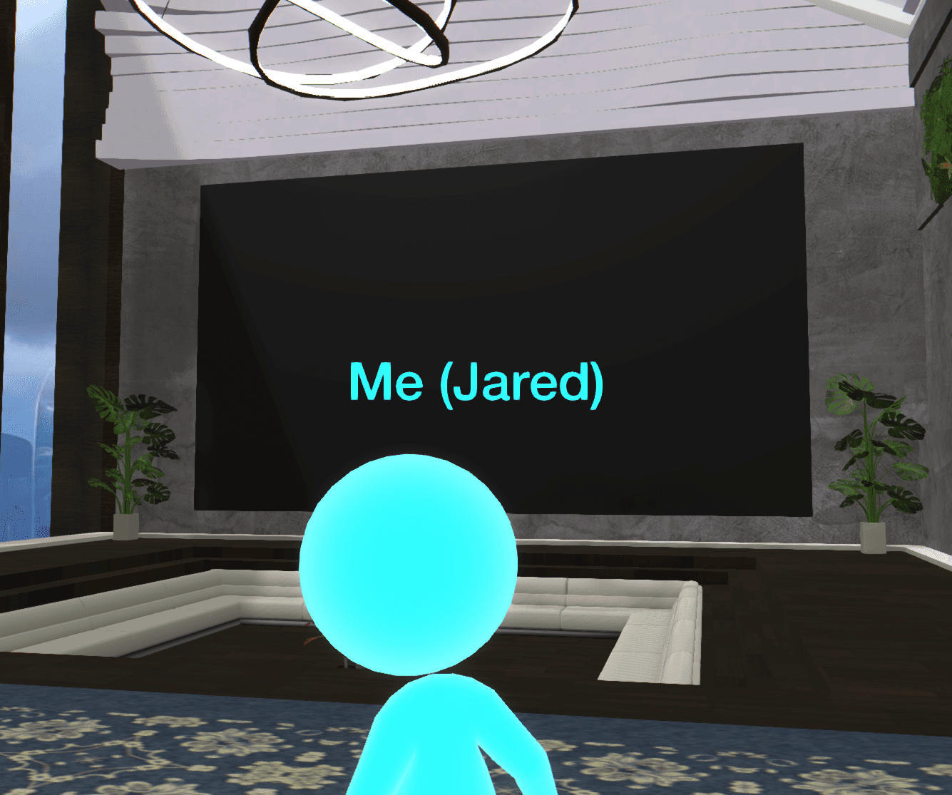
The Home World is an immersive space users enter post-sign up or log in. It serves as a hub to explore user-generated worlds and create new worlds.
PROJECT 3
Community World Onboarding
In the fall of 2023, we wanted to implement a community world for people to upload images and videos of the things they love within the world, which would then be showcased to others.
THE CHALLENGE
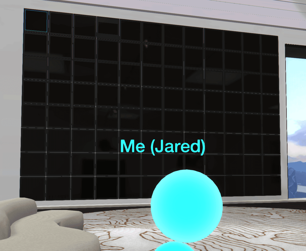
There are over 50 screens in a community world, and because uploading content to each screen takes a few clicks, it would take a lot of time to populate all screens.
The many screens of the Community World.
THE SOLUTION
To cut down on upload time, I was tasked with creating an onboarding process for users to mass-upload media files.
Lessons Learned
If I had a chance for a do-over, I would…
DO MORE RESEARCH
The tasks for this project leaned more heavily on UI design due to a lack of quality UX research. A better understanding of user pain points in the metaverse space would have resulted in better-informed functionality on the platform.
CONDUCT MORE USER TESTING
New features on a weekly basis were requested from management, which meant most of my time was spent creating the UI for said features, and no time for actual user testing to iterate on the most recent build.
STRONGLY ADVOCATE UX
Being more assertive in advocating for better UX research and testing in the initial stages of the product could have strongly influenced the direction of the product for the better. Currently, the purpose and direction of the product is being re-evaluated.
Contact


