CLIENT
Youngster.co
DEVICES
Mobile
DURATION
2-week sprint (May 2022)
METHODS
Business analysis
Heuristic evaluation
Online survey
Customer journey map
User flow & task flow
Usability testing
Wireframing
Prototyping
OVERVIEW
The client wanted to scale their business by recruiting more teenagers and young adults to their platform. In our research, applicants found the onboarding process confusing and time-consuming, so we focused on addressing those pain points.
We reduced the number of steps it takes applicants to access their account, and updated the UI that follows brand guidelines and modern design conventions.
THE BRIEF
Youngster.co is a certified social enterprise connecting tech savvy youngsters with seniors that need help with technology.
The client wants to scale the business in the short term by spending more time on business development, and spending less time doing administrative work
We ended up focusing our efforts optimizing the job application process
This is a vital point of engagement between youngsters and the brand.
A seamless sign-up process is a way to demonstrate legitimacy and professionalism for the organization.
Addressing frustrations in this process could reduce drop-offs.
The time spent helping applicants can instead go towards building their business.

RESEARCH FINDINGS (HEURISTIC ANALYSIS)
Providing documentation during the verification process is a lot of work.
Lack of transparency may cause hesitation to provide documentation.
The time it takes to complete the application process feels laborious.
Youngsters we spoke to validated some of our observations:
😣 “I’m frustrated because I have to provide all documentation before gaining access to the dashboard.”
🤷🏻♂️ “I didn’t know what screen I landed on after providing all documentation. It was just a blank page.”
😒 “I couldn’t upload my police check so I had Youngster.co upload it for me.”
SOLUTION
Since onboarding is an arduous process, we devised ways to make the job application process more user-friendly.
The old process
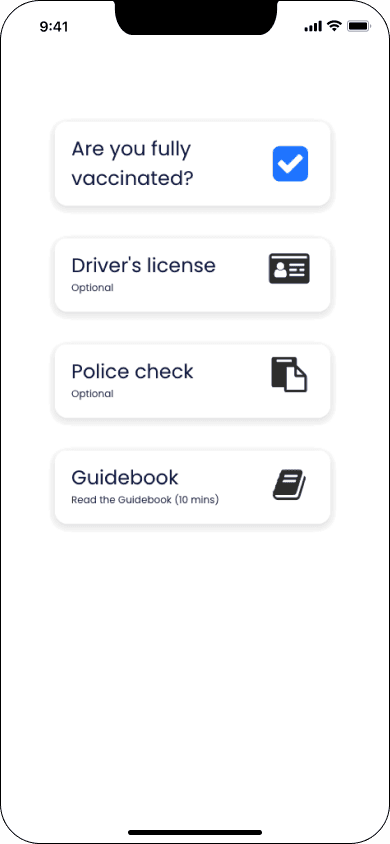
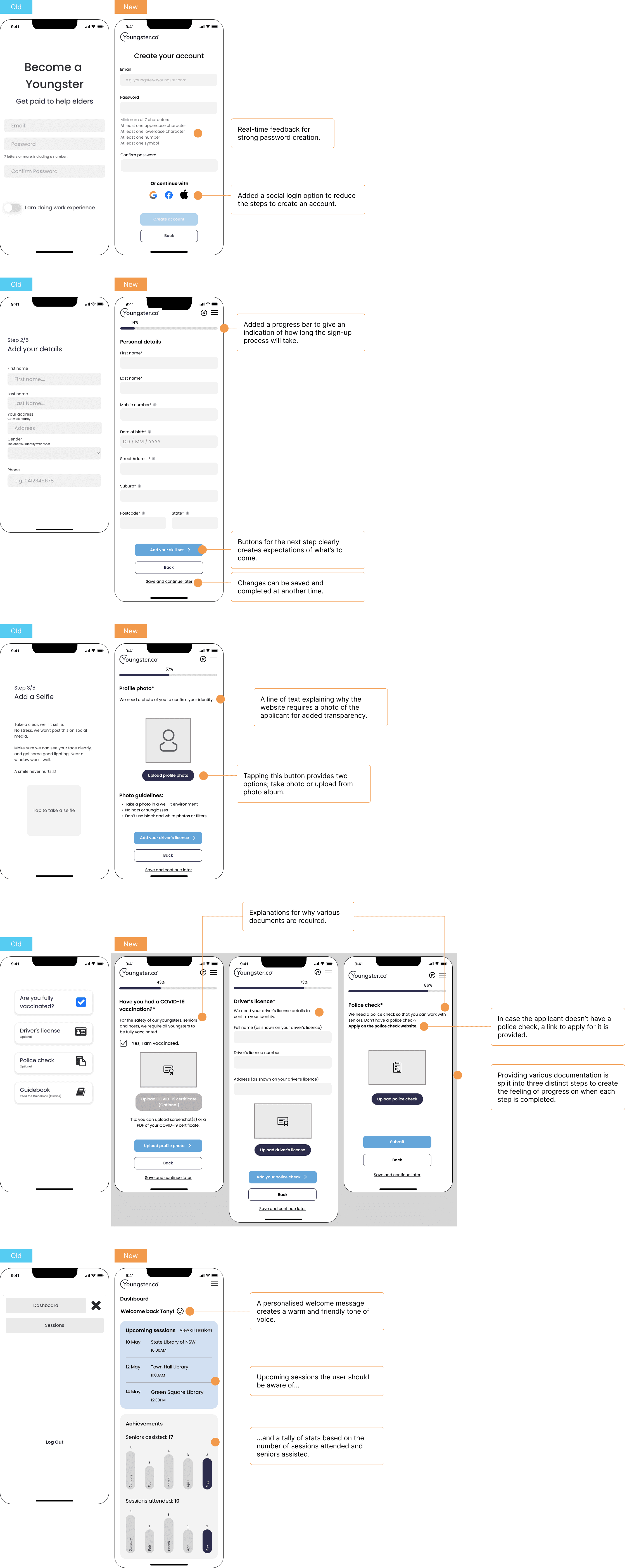
Currently, applicants need to provide their email and password, personal information, documentation, and be approved (4 steps!) before they can access the dashboard.
The new process
We decided to improve the user flow by letting youngsters gain access to the dashboard in upon providing their email and password or via single sign-on (1 step!), making the process feel shorter.
The process of providing other required information has been moved to the dashboard. Within the dashboard, their submitted documentation can be saved.
UI DESIGN
Since onboarding is an arduous process, we devised ways to make the job application process more user-friendly.
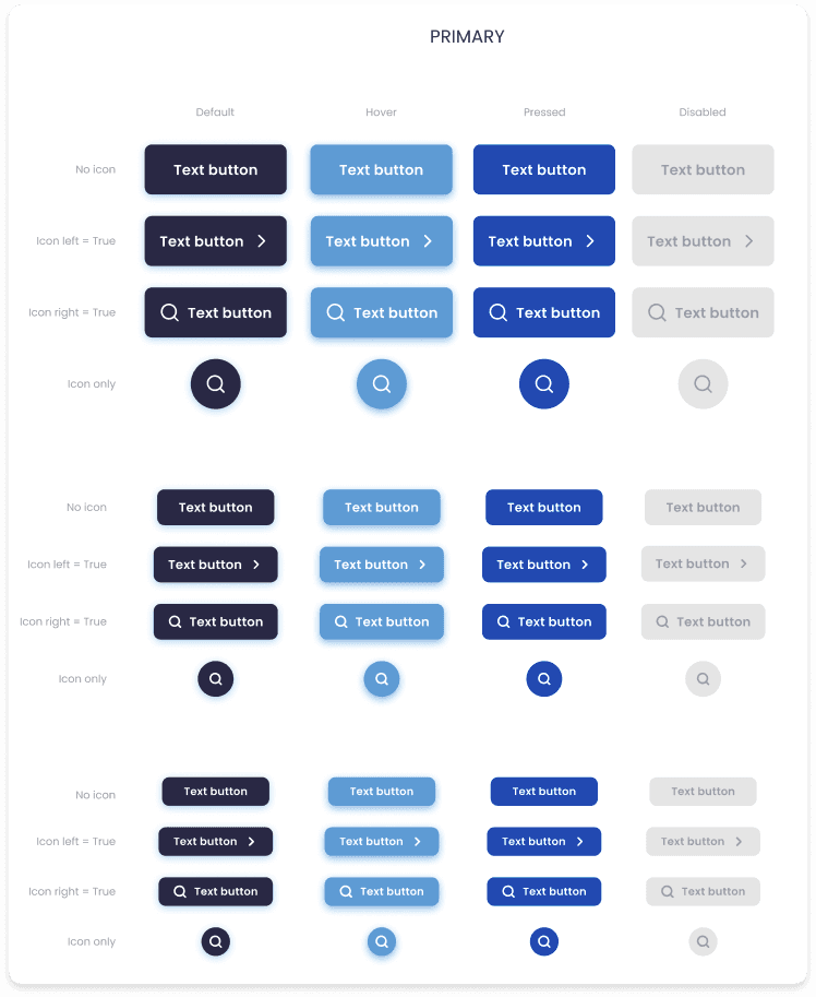
We built our high fidelity wireframes off existing brand guidelines and assets.
SUMMARY
Identified bottlenecks and frustrations of the current process.
Deconstructed the existing process to address pain points.
Developed wireframes and a detailed prototype based on the new user flow.
NEXT STEPS
The business should conduct user interviews to inform features that should be added to the dashboard.
The business should conduct usability tests to iterate on the proposed solutions.
REFLECTIONS
We protected ourselves by focusing on the most crucial deliverable given our constraints, and communicating that clearly with the client early in the project.
Assumptions and hypotheses should be validated early in case you need to take the project in a different direction.
Contact


